I wrote a blog post about an R function to visualize an alignment matrix long time ago. I no longer use the function because the “ape” package now has a function, called “image.DNAbin”, which does exactly the same thing.
When I was analysing my SNP data, I found the image.DNAbin does not show ambiguous bases which represent heterozygous sites.
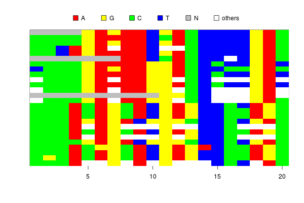
Although I can tell the function to show ambiguous letters, say, “Y” or “M”, in the image, it does not automatically assign colors to them.
If the ambiguous bases are colored by the “in-between” of two unambiguous bases, (say, if A is red and C is yellow, M=A/C is in an orangish color), the plot will be much more informative.
R has a function to generate colors between two colors, called “colorRamp”. It is an interesting function which returns a function to interpolate colors between two colors.
RY <- colorRamp(c('red', 'yellow'))
RY(seq(0, 1, 0.1))
      [,1]  [,2] [,3]
 [1,]  255   0.0    0
 [2,]  255  25.5    0
...
[10,]  255 229.5    0
[11,]  255 255.0    0
In the case above, the function “RY” returns RGB values interpolating red and yellow. You can convert these values into color codes by the “rgb” function. Using these functions, a nice color gradation is easily drawn.
g <- rgb(colorRamp(c('darkblue', 'lightblue'))(seq(0,1, 0.1)), max=255)
barplot(1:10, col=g, border=F)

Using the “colorRamp”, I wrote a simple code to generate 6 colors for heterozygous bases from 4 colors for unambiguous bases.
image.h <- function(sq, col=c('red','yellow','green','blue')) {
	bases <- c('a', 'g', 'c', 't')
	dbases <- c('r', 'm', 'w', 's', 'k', 'y')

	dcol <- apply(combn(col,2), 2, function(x){rgb(colorRamp(x)(0.6), max=255)})

	image(sq, col=c(col, dcol, 'lightgrey', 'black'), what=c(bases, dbases, 'n', '-'))
}
The four colors, red, yellow, green and blue, are colors for A, G, C, and T respectively. The “colorRamp” function in the fifth line generates 6 colors from the combinations of the 4 colors.
The image drawn by the new function looks OK. The heterozygous sites are shown in reasonable colors, like orange, purple and bluish green.
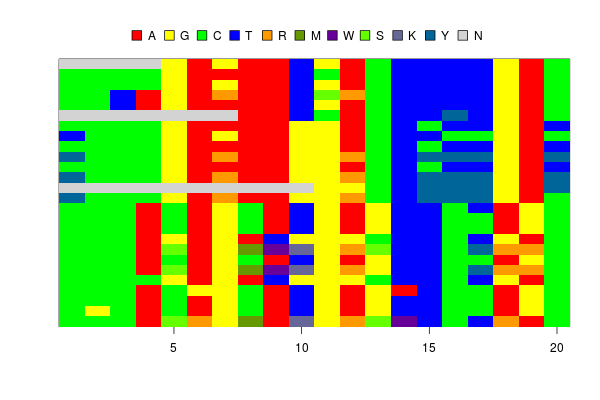
However, there is one problem. The color for “K” is grey, which is the same color for “N”. This is because the colors for “G” and “T” are complementary and produce grey when they are mixed.
Is there a set of colors for AGCT which does not produce grey when they are mixed?
I guess the answer is no, at least with simple colors like red-green-blue and cyan-magenta-yellow. Because when you choose 4 colors from these basic 6 colors, at least one pair is always complementary. (If you see an RGB cube, this is obvious. You can never choose 4 vertices without including a pair of opposite ones. Black and white are not allowed.)
Interestingly, when I google color schemes for DNA bases, they often use complementary colors to show complementary bases, say, blue for A and yellow for T. I think this is an intuitive decision, but I want to avoid using the complementary colors for my function.
I found designing good color schemes for DNA bases is an interesting topic, and it looks very difficult to design schemes which are both informative and beautiful. A set of vivid, informative colors often contains complementary colors while restricting your color space to avoid using them makes the image opaque and less informative.
What I did in the script is to use 0.6, instead of 0.5 for colorRamp argument not to take the exact mid points between two colors and to avoid producing the identical greys. But, probably, there must be better approaches.
