Category Archives: R

Superimposing maps of two cities with ggmap

I recently moved from Kyoto to Paris to do my second postdoc. In the process of flat hunting in Paris, which has been very hard  because of  the rising housing cost, I walked around some different parts of Paris. One impression I had is Paris is small. Once you walk through the city,  you will find this quite easily.

My intuition told me that its size is almost close to the size of Kyoto, which is a medium-sized city in Japan. But, is it true? I found a website comparing London and Paris, and it says London is larger than Paris, but no comparison between Paris and Japanese cities exists.

So, I just checked by superimposing maps of the two cities. I used an R package called “ggmap”, a very nice geographic visualization package built based on ggplot2.

I first downloaded maps of Paris and Kyoto in 15km squares surrounding city centers. (I chose the Cite island for Paris and Shijo-Karasuma for Kyoto as centers). This process was a bit tricky because maps are defined by longitudinal and latitudinal range. The identical longitudinal ranges do not represent the same distance when the cities’ latitudes are different. I used the “great circule distance” equation to adjust the effect of latitude on the longitudinal distance and and find appropriate ranges.

R <- 6371
#convert distance to longitudinal range given a latitude
delta.lambda <- function(d, phi=0.0) {
	2*asin(sin(d/R/2)/cos(phi))
}

#create longitudinal and latitudinal ranges which define a suquare with length d
map.range <- function(d, lat=0.0, lon=0.0){
	dphi <- d/R*360/2/pi
	dlambd <- delta.lambda(d, phi=lat*2*pi/360)*360/2/pi

	lonrange <- lon + c(-dlambd/2, dlambd/2)
	latrange <- lat + c(-dphi/2, dphi/2)

	rang <- c(lonrange, latrange)
	names(rang) <- c("left", "right", "bottom", "top")
	return (rang)
}

In the above code, the map.range function returns longitudinal and latitudinal range which covers a square with its side length = d km.

Once you can define a range to draw, downloading and plotting maps is simple thanks to ggmap functions.

d <-15 #15kmx15km map
z <- 12 #Zoom level
kyoto_center <- c(35.0, 135.76)
kyoto <- map.range(d, lat=kyoto_center[1], lon=kyoto_center[2])
kyoto_map <- get_stamenmap(kyoto, zoom=z, maptype="toner")
ggmap(kyoto_map)

paris_center <- c(48.855, 2.34)
paris <- map.range(d, lat=paris_center[1], lon=paris_center[2])
paris_map <- get_stamenmap(paris, zoom=z, maptype="toner")
ggmap(paris_map)

The “get_stamenmap” function downloads a map from Stamen Maps. If you like Google map, use “get_googlemap” function to download from Google map.

maps

The two maps plotted side by side tells me a lot. For examplem the Peripherique motor way, which defines Paris, looks quite similar size as the city of Kyoto surrounded by mountains.

Superimposing two maps was another tricky point. The ggmap has two ways for superimposition of graphics, “inset_map” and “inset_raster”. It seems “inset_raster” is an appropriate function because it allows me to set coordinates for regions you superimpose graphics. One problem is that it does not allow me to change alpha value. I just added alpha values to the raster graphics of the map and plot it using the inset_raster.

translucent.raster <- function(map){
	tmp <- as.matrix(map)
	tmp <- gsub("$", "55", tmp)
	tmp <- gsub("FFFFFF", "0000FF", tmp)
	ras <- as.raster(tmp)
	attributes(ras) <- attributes(map)
	ras
}

ggmap(paris_map) + inset_raster(translucent.raster(kyoto_map), xmin=paris["left"], ymin=paris["bottom"], xmax=paris["right"], ymax=paris["top"])

superimpose.02

This is a bit awkward way, but the result looks OK. Now, I can compare landmarks more precisely.

The Golden and Silver temples (indicated by small black arrows), which define north-west and north-east edges of Kyoto area are almost on the Peripherique. This means walking from the Cite island to the Peripherique is just like walking from Shijo-Karasuma to the Silver temple. Probably, this distance similarity made me feel that the two cities are in similar size.

Of course, Paris has much larger suburban area, and the size of Paris metropolitan area is much larger than Kyoto. But, my intuition looks more or less correct.
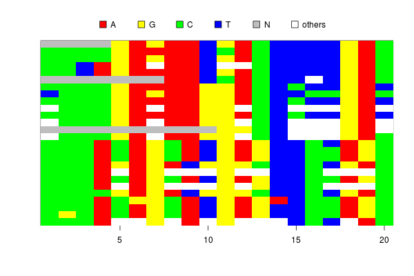
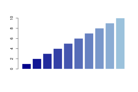
image.h.R: how to color your bases

I wrote a blog post about an R function to visualize an alignment matrix long time ago. I no longer use the function because the “ape” package now has a function, called “image.DNAbin”, which does exactly the same thing.

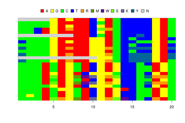
When I was analysing my SNP data, I found the image.DNAbin does not show ambiguous bases which represent heterozygous sites.

image.snp


Although I can tell the function to show ambiguous letters, say, “Y” or “M”, in the image, it does not automatically assign colors to them.

If the ambiguous bases are colored by the “in-between” of two unambiguous bases, (say, if A is red and C is yellow, M=A/C is in an orangish color), the plot will be much more informative.

R has a function to generate colors between two colors, called “colorRamp”. It is an interesting function which returns a function to interpolate colors between two colors.

RY <- colorRamp(c('red', 'yellow'))
RY(seq(0, 1, 0.1))
      [,1]  [,2] [,3]
 [1,]  255   0.0    0
 [2,]  255  25.5    0
...
[10,]  255 229.5    0
[11,]  255 255.0    0

In the case above, the function “RY” returns RGB values interpolating red and yellow. You can convert these values into color codes by the “rgb” function. Using these functions, a nice color gradation is easily drawn.

g <- rgb(colorRamp(c('darkblue', 'lightblue'))(seq(0,1, 0.1)), max=255)
barplot(1:10, col=g, border=F)

color.bar


Using the “colorRamp”, I wrote a simple code to generate 6 colors for heterozygous bases from 4 colors for unambiguous bases.

image.h <- function(sq, col=c('red','yellow','green','blue')) {
	bases <- c('a', 'g', 'c', 't')
	dbases <- c('r', 'm', 'w', 's', 'k', 'y')

	dcol <- apply(combn(col,2), 2, function(x){rgb(colorRamp(x)(0.6), max=255)})

	image(sq, col=c(col, dcol, 'lightgrey', 'black'), what=c(bases, dbases, 'n', '-'))
}

The four colors, red, yellow, green and blue, are colors for A, G, C, and T respectively. The “colorRamp” function in the fifth line generates 6 colors from the combinations of  the 4 colors.

The image drawn by the new function looks OK. The heterozygous sites are shown in reasonable colors, like orange, purple and bluish green.

imageh.snp

However, there is one problem. The color for “K” is grey, which is the same color for “N”. This is because the colors for “G” and “T” are complementary and produce grey when they are mixed.

Is there a set of colors for AGCT which does not produce grey when they are mixed?

I guess the answer is no, at least with simple colors like red-green-blue and cyan-magenta-yellow.  Because when you choose 4 colors from these basic 6 colors, at least one pair is always complementary. (If you see an RGB cube, this is obvious. You can never choose 4 vertices  without including a pair of opposite ones. Black and white are not allowed.)

Interestingly, when I google color schemes for DNA bases, they often use complementary colors to show complementary bases, say, blue for A and yellow for T. I think this is an intuitive decision, but I want to avoid using the complementary colors for my function.

I found designing good color schemes for DNA bases is an interesting topic, and  it looks  very difficult to design schemes which are both informative and beautiful. A set of vivid, informative colors often contains complementary colors while restricting your color space to avoid using them makes the image opaque and less informative.

What I did in the script  is to use 0.6, instead of 0.5 for colorRamp argument not to take the exact mid points between two colors and to avoid producing the identical greys. But, probably, there must be better approaches.


A better plot function for GMYC result

I have received some emails and comments about the plotting function of the splits package. The plot.gmyc lacks some options. It cannot change the font size of the sample names, colors of tips, size of margins and so on. Surely, these options are important for the presentation of results. I have been thinking of updating the function, but its code is a mixture of codes written by several people and disentangling them appears a bit laborious.

So, for now, I upload a new version of the plot function.

plot.result <- function(res, cex=0.5, edge.width=1, no.margin=F, show.tip.label=T, label.offset=0) {
	plot.tree <- function(tr, mrca, cex=0.5, edge.width=1, no.margin=F, show.tip.label=T, label.offset=0) {
		traverse.subtree <- function(tr, n=1) {
			numtip <- length(tr$tip.label)
			sub.node <- tr$edge[which(tr$edge[,1] == n+numtip), 2]

			res.node <- c()
			for (sn in sub.node) {
				res.node <- c(res.node, sn)
				res.node <- c(res.node, traverse.subtree(tr, sn-numtip))
			}
			return (res.node)
		}

		numtip <- length(tr$tip.label)
		br.col <- rep(1, length(tr$edge.length))

		for (i in mrca) {
			for (j in traverse.subtree(tr, i-numtip)) {
				br.col[which(tr$edge[,2]==j)] <- 2

			}
		}

		plot(tr, edge.color=br.col, show.tip.label=show.tip.label, cex=cex, edge.width=edge.width, no.margin=no.margin, label.offset=label.offset)
	}

	plot.tree(res$tree, res$MRCA[[which.max(res$likelihood)]]+length(res$tree$tip.label), cex=cex, edge.width=edge.width, no.margin=no.margin, show.tip.label=show.tip.label, label.offset=label.offset)
}

This plot function accepts the common options of the ape’s plot.phylo function, including cex, edge.width, etc.

You can change the color of edges by replacing “2” at the end of line 20 with another number or a color name. For instance,

br.col[which(tr$edge[,2]==j)] <- "blue" 

This makes branch colors blue.

The function can be used like the old plot function, and it should be more flexible than the old one.

 >res <- gmyc(test.tr)
>plot.result(res, no.margin=T, cex=0.3, edge.width=1.5)

plot.result

from R to Python (2): libraries for statistical analysis

A couple of years ago, I wrote a post about differences between R and Python. It mainly reported differences on grammars of these languages, which I found interesting when I translated my codes.

However, I found the post is not so informative for readers looking for a primer for “Python as an environment for statistical analysis” (, which can be alternative to R). So, I will write down what I recently learned on statistical analysis using Python.

If you want to develop an R-like environment for interactive statistical analysis using Python, first you need to install following libraries:

The pandas library provides functions and classes for interactive data analysis, for example, R-like data frame, and the statsmodels for statistical modelling like GLM. The matplotlib and numpy/scipy are required for better plotting, numerical calculations and vector handling. They are mainly called from pandas and statsmodels, but you can also directly call their functions.

Installation of these libraries is relatively easy if you use Unix-like operating system, but may not so if you use Windows or Mac. However, there are plenty of documentations on how to install them on Mac or Win like this.

In addition to the libraries, you’d better install IPython, a better interactive shell for Python. IPython provides you with a command-line completion much better than the default Python shell. Without a good command completion, interactive analysis would become very stressful.

Armed with IPython and these libraries, you can do almost the same things as you can with R.

import pandas

iris = pandas.read_csv("./iris.txt", sep="\t")

iris.head()

You will read a tab-delimited file by read_csv, and show first few lines of the table on console. The pandas.read_csv reads a tab-delimited table and returns a DataFrame object. As its name indicates, the DataFrame supports similar functions to the data.frame in R. The “head” is a method of the dataframe which shows part of its rows. You will see results like below when you execute the code in IPython.

In [1]: import pandas

In [2]: iris = pandas.read_csv("./iris.txt", sep="\t")

In [3]: iris.head()
Out[3]:
Sepal.Length Sepal.Width Petal.Length Petal.Width Species
0        5.1         3.5          1.4         0.2  setosa
1        4.9         3.0          1.4         0.2  setosa
2        4.7         3.2          1.3         0.2  setosa
3        4.6         3.1          1.5         0.2  setosa
4        5.0         3.6          1.4         0.2  setosa

[5 rows x 5 columns]

You can access columns of data frame with their names as you can with R. Also, slicing with indices, accessing entries with conditions are supported.

#select a column named "Species"
iris["Species"]

#select first 5 elements of column "Petal.Length"
iris["Petal.Length"][0:5]

#select rows with which "Species" is equal to "virginica", then show first 5 rows
iris[iris["Species"]=="virginica"].head() 

Commands above will return the following outputs.

In [4]: iris["Species"]
Out[4]:
0 setosa
1 setosa
2 setosa
3 setosa
4 setosa
...

In [5]: iris["Petal.Length"][0:5]
Out[5]:
0 1.4
1 1.4
2 1.3
3 1.5
4 1.4
Name: Petal.Length, dtype: float64

In [6]: iris[iris["Species"]=="virginica"].head()
Out[6]:
Sepal.Length Sepal.Width Petal.Length Petal.Width Species
100      6.3         3.3          6.0         2.5 virginica
101      5.8         2.7          5.1         1.9 virginica
102      7.1         3.0          5.9         2.1 virginica
103      6.3         2.9          5.6         1.8 virginica
104      6.5         3.0          5.8         2.2 virginica

[5 rows x 5 columns]

Basic statistics are supported by methods of dataframe.

#count the number of occurrance
iris["Species"].value_counts()

#mean of each columns
iris.mean()

Counts of numbers of species and means of columns will be returned.

In [7]: iris["Species"].value_counts()
Out[7]: 
setosa        50
versicolor    50
virginica     50
dtype: int64

In [8]: iris.mean()
Out[8]: 
Sepal.Length    5.843333
Sepal.Width     3.057333
Petal.Length    3.758000
Petal.Width     1.199333
dtype: float64

Also, there are several types of plotting methods.

#boxplot
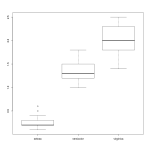
iris.boxplot(by="Species", column="Petal.Width")

#scatter plot matrix
pandas.tools.plotting.scatter_matrix(iris)

The first line plots a boxplot of “Petal.Width” by “Species”. The second line plots a scatter plot matrix. Make sure that you start IPython with the “–matplotlib” option to enable plotting.

figure_1 figure_2

If the Python codes above are translated into R, they look like the following R code.

iris <- read.table("./iris.txt", sep="\t", header=T)

head(iris)

iris$Species
iris$Petal.Length[1:5]
head(iris[iris$Species=="virginica",])

table(iris$Species)
colMeans(iris)

boxplot(Petal.Width ~ Species, data=iris)
pairs(iris)

plotinr1 plotinr2

The codes in Python and R are very similar. Functions of pandas are almost like object-oriented version of R functions. You can find very basic functions of pandas in their documents. It appears IPython+pandas have as many functions for basic data manipulation and visualization as R has.  So, how about statistical analysis like regression modelling? I will write about in the next post.

exact.match.pairs.R for showing exactly matched species

One of users of the splits package asked me if there is a function to show pairs of species which have exact match. The comp.delimit function counts the number of exact matches between 2 groupings, but does not show which species matches with which one. Surely, it is useful to have this type of information.

At first, tracking pairing information looked complicated for me, but actually it is easily done by simple modifications on existing codes.

exact.match <- function(x, y) {
	if (length(x) != length(y)) {
	return (NA)
	}

	match <- 0
	for (l1 in unique(x)) {
		for (l2 in unique(y)) {
			l1_ids <- sort(which(x == l1))
			l2_ids <- sort(which(y == l2))

			if (length(l1_ids) == length(l2_ids) && all(l1_ids == l2_ids)) {
				match <- match + 1
			}
		}
	}
	return (match)
}

The code above is the “exact match” function used in the comp.delimit. It runs on 2 vectors of delimitation. It does pairwise comparisons between all pairs of species and records the number of pairs which matched exactly.

For instance, consider 2 alternative groupings x=(A,A,B,C) and y=(1,1,2,2) (,where the first element of each vector is species of the first sample, and the second, the third and so on.) The function returns 1, which means one match between species A and species 1.

Tracking the names of pairs with exact match is done just by replacing the counter of matches in the code above with a matrix which keeps names of matched pairs.
The modified code is below.

exact.match.pairs <- function(d1, d2) {
	if (nrow(d1) != nrow(d2)) {
		return (NA)
	}

	x <- d1[,1]
	y <- d2[match(d1[,2], d2[,2]), 1]

	pair <- c()
	for (l1 in unique(x)) {
		for (l2 in unique(y)) {
			l1_ids <- sort(which(x == l1))
			l2_ids <- sort(which(y == l2))

			if (length(l1_ids) == length(l2_ids) && all(l1_ids == l2_ids)) {
				pair <- rbind(pair, c(l1, l2))
			}
		}
	}
	return (pair)
}

Another small modification is the function now accepts 2 tables of delimitation instead of 2 vectors. Lines 6 and 7 were added to sort tables by sample names. The first column of the table must be species names, and the second column sample names.

For a gmyc result, res1, and a dataframe of delimitation, d, it is used as follows.

>exact.match.pairs(spec.list(res1), d)

For 2 tables of delimitation,

>exact.match.pairs(d1, d2)

These commands return a matrix containing pairs of species.

[,1] [,2]
[1,] “1” “spec1”
[2,] “2” “spec18”
[3,] “5” “spec26”
[4,] “12” “spec16”
[5,] “14” “spec25”